« AU recs update | Main Index | (not really) exponential growth... »
01/04/2004: about Daredevil: Echo (by David Mack)
The pile of comics I want to comment on is starting to get huge and intimidating. Obviously I have to make small steps...so here are my comments on the two latest Daredevil issues #54 and #55, which marks the end of David Mack's Echo storyline. Actually my comments are more about the whole than about these individual issues.
I have grumbled about this storyline, mostly because it's Daredevil's book and the story isn't about Daredevil, except in the most peripheral way. I think it should have been published as a mini-series called Echo.
I still would have bought it.
I love David Mack's art -- not just this, and not just when the pages are painted or with collages either, he does good b/w as well for example -- and despite the Mary Sueish qualities of Echo, the story is still interesting. And really, what I mean with "Mary Sueish qualities" is only relevant in the context of looking at it as a Daredevil book, if you come to it thinking of her as the hero, the tragic childhood, the disability countered with special abilities, the love affair with Daredevil, not to mention that she takes over Daredevil's book, isn't really relevant, because she's the center of her story. And it is sufficiently interesting, and gorgeously told. I mean, I think I might have liked it better if David Mack had illustrated Daredevil's mind, but well, I'll take Echo's too.
And when I read #55 today, I realized one thing I found fascinating about the art, beyond liking David Mack. IMO the style works to represent Echo's internal POV, because it tries to reflect her deafness. Which seems kind of trivial, but I never quite made the conscious connection why in this particular case the mix of collage techniques really works so well for me, when often I find it just pretentious, and detrimental to the storytelling when stuff is pasted all over a comic page, and panels arranged in strange ways. Previously I had just connected the "special parts" like images of signs with the illustrating her deafness, and the rest just worked somehow, but now I think far more of the graphic techniques underscore it.
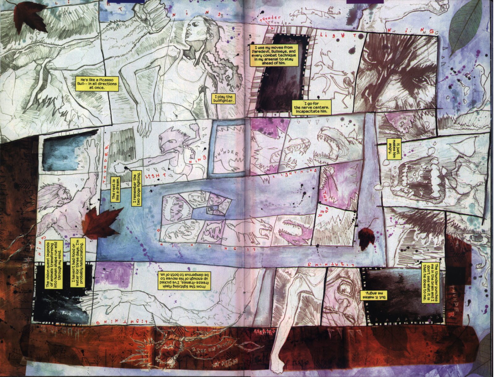
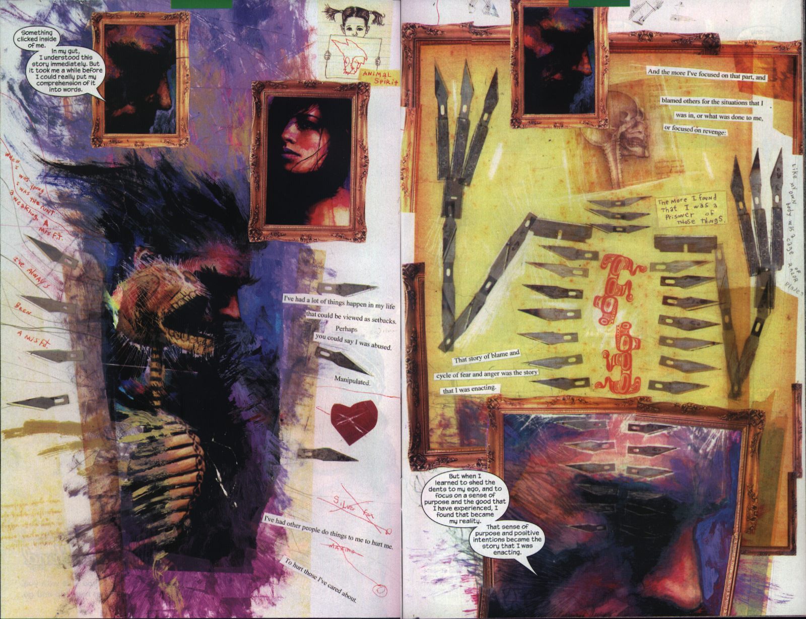
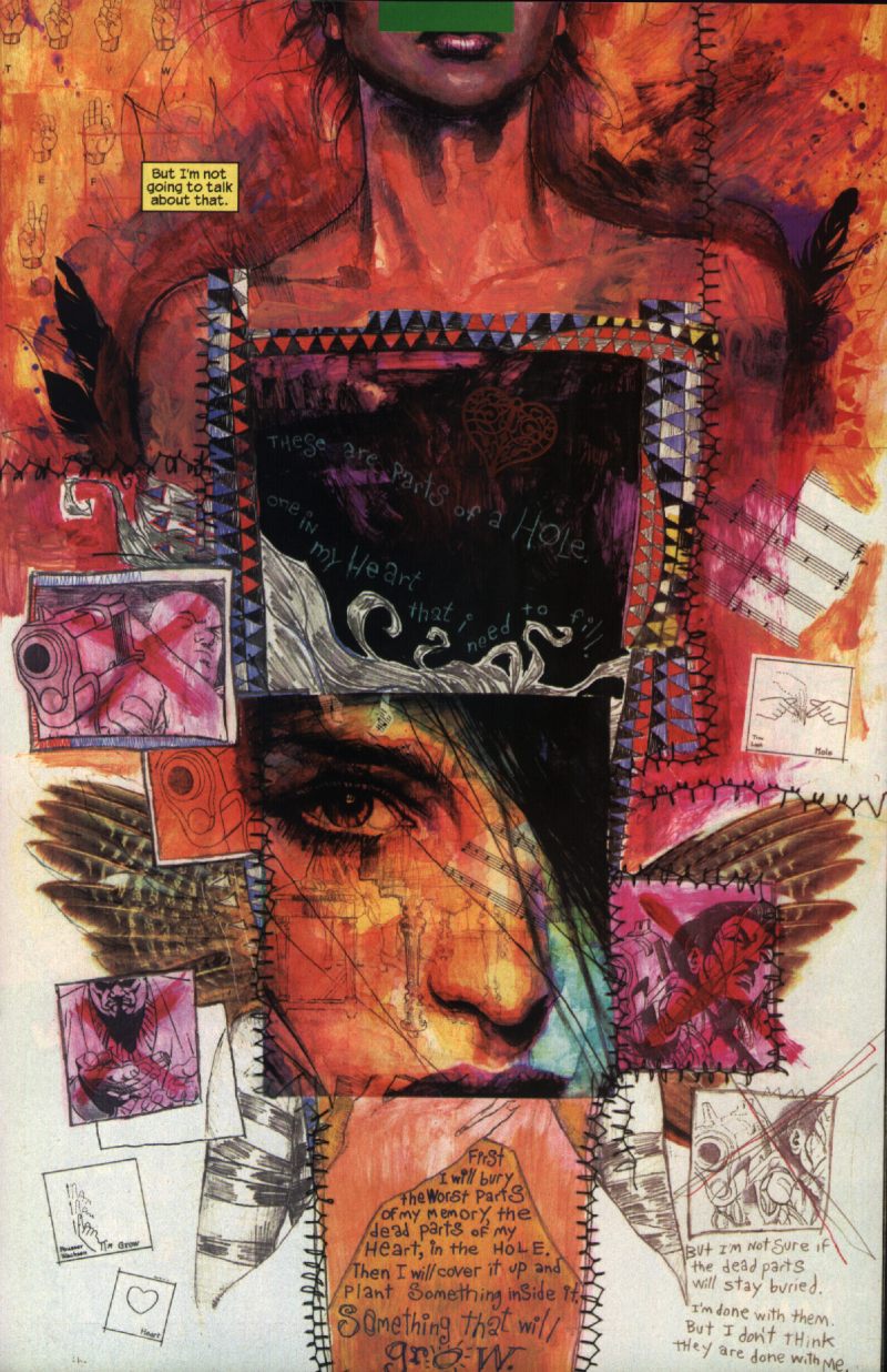
It's hard to explain without seeing the pages, so I scanned two double pages, one from #54 and one from #55, and a single page from #51 to illustrate what I'm talking about (the images are quite large, i.e. 440K, 375K and 230K). They are not really special pages, nor have I tried to find the "best," I just scanned the pages that came to my mind when I tried to explain my point.
Now obviously as a non-deaf person I can't really imagine how a deaf person thinks (that is in general, I guess how exactly internal thoughts are present for any specific person probably varies anyway, deaf or not), and also a fair amount of her thoughts is written as English texts, but my point is more that the style is sufficiently different from how the "usual" internal monologues, flashbacks, and their various combinations in comics look, that it illustrates that on several levels. Just as sign language is spatial, and not just sequential, the text is often arranged on the page not in blocks but differently. Sometimes it's curving lines, or it's squeezed into the pictures, changing direction and color, some text is scratched handwriting like from a child, other in more adult handwriting, sometimes it's typed, but cut into pieces and pasted, sometimes scrabble pieces form words, and of course sometimes it's just pictures of her thoughts (it's a comic after all) without text, and throughout also pictures both of gestures in sign language and of pictographs are pasted as part of the collage style.
In earlier issues adaptions of modern painting styles, like impressionist, expressionist and cubist portraits, are used to express moods. Also the pictures (I say "pictures" because not all are "panels" in the usual sense) are arranged in unconventional ways, drawing even more attention to the spatial quality of storytelling in comics. For example in #54 there's this double page (the one I scanned), where the panels are arranged in a spiral, and to read the text boxes you also have to turn the comic.
Throughout text guides the eye less than usual in comics, or rather the regular text, that is the text in neat square boxes, and the speech balloons, still do that, give order and reading directions, but the other texts, here more immediate internal thoughts, look at first like parts of the collage, to be taken in as a visual whole -- especially since there's also writing sometimes that you really can't make out -- and only when you look closer it becomes clear that those too are part of the story. The reading order is less important in those, still they are not arranged arbitrarily, like some, especially the typed are confidently spaced, more "adult thoughts" in a way closer to the text boxes, others are more emotional, squeezed into the images, winding their way close to the page borders, showing all kinds of emotions. All these texts are like a stream of consciousness in a way, and there is also herself as a little girl holding up signs with symbols, images or writing.
As a comic showing us the mind and thoughts of Echo while she works out her problems, it is great. It's only problem is that it's just not really a Daredevil comic.